Bibi Records
In our first meeting, the clients believed they only needed a visual identity to complement the brand they had created themselves five years earlier. But the deeper I explored their needs, the clearer it became that the brand was facing more fundamental challenges.
I invited them to go back to the beginning — to rebuild the foundation of what was then still called Bibi Discos (in its original Brazilian form), which later evolved into Bibi Records.
The original brand — including the logotype — had been created by the owners themselves. While it held sentimental value for them, it lacked clarity and professionalism. One major issue was the logotype design: many customers misread the name as “Biib” instead of “Bibi”. Despite this, the couple initially envisioned only a visual refresh, not a full logo redesign.
To support strategic decision-making, I began the project by conducting brand perception research with their audience. The goal was to understand how people felt about the current identity and whether the logo communicated effectively – while also gaining insights about Bibi audience to optimize their business efforts.

Bibi Discos original logo
Survey response highlights: a significant number of participants misread the brand name and associated the logo with attributes that did not reflect the founders’ intended positioning.
The results confirmed the need for change: over half of the respondents said they read the brand name as “Biib,” and many described the overall identity as outdated or inconsistent with the quality of their shopping experience.
The experiment also helped uncover Bibi’s strengths — what people truly loved about the brand — and revealed elements that were worth preserving and simply reimagining, rather than discarding.
What emerged was the vision of a bold brand that breathes music, city life, and a touch of rebellion. Rather than imposing rigid rules, the identity serves as a creative springboard for daring expressions that honor the vintage, graphic soul of vinyl culture — keeping alive the vibrant energy that drives Bibi: a celebration of sound and authenticity, created by music lovers for music lovers.
A full rebrand
… keeping what matters
This research helped the founders realize they were at risk of missing a significant opportunity by clinging to the old logo. Backed by real audience feedback, they felt confident to move forward with a full rebrand.
The new Bibi Records
The clients envisioned Bibi becoming a global record store, so I also proposed renaming the brand to ensure clear worldwide recognition. That’s how Bibi Records was reborn: bold, fun, urban, and approachable — carrying the mark of one of its founders in its name, so why not reflect that in the symbol as well?
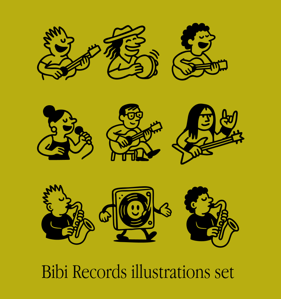
While maintaining the graphic essence of the previous identity, I developed an illustrated logo that conveys the human side of a company created and led by people passionate about vinyl.
The visual identity brings together emotional and urban references, blending illustrations inspired by the expressive linework of 1990s Brazilian comic strips with elements of street culture — like wheatpaste posters, embroidered jacket patches, and textures reminiscent of printed paper.
I also designed the entire launch strategy, including the reels on the left, to introduce the new brand to the world.


The visual identity created for Bibi Records captures the essence of the urban music universe. Inspired by record culture — audacious, graphic, and vintage — the brand provides a solid yet versatile foundation for creative applications across a wide range of materials. Every graphic expression tied to this world is welcome — from stamps to stencil-style applications of the logo.


